The rasterVis package
Here, we will explore the basic functionality of the rasterVis package. As the name already suggests, the purpose of this package is to display raster data.
While the common R packages to work with rasters, like raster or terra, already provide basic plotting functionality, rasterVis extends this substantially.
You can find a more extensive documentation for the package here.
library(rasterVis)
library(terra)
First we need to load some rasters. We will use the geodata package to download a digital elevation model of Austria.
dem_austria <- geodata::elevation_30s(country = "Austria", path = "data/")In addition, I want to show you how changes over time can be displayed. So we will also need spatio-temporal data. Below, we download and load solar irradiance data from the Satellite Application Facility on Climate Monitoring (CMSAF). There are a series of packages that you could also use specifically to access these data, for example the cmsaf package.
download.file('https://raw.github.com/oscarperpinan/spacetime-vis/master/data/SISmm2008_CMSAF.zip',
              'SISmm2008_CMSAF.zip')
unzip('SISmm2008_CMSAF.zip')
listFich <- dir(pattern='\\.nc')
stackSIS <- stack(listFich)
stackSIS <- stackSIS * 24 ##from irradiance (W/m2) to irradiation Wh/m2
idx <- seq(as.Date('2008-01-15'), as.Date('2008-12-15'), 'month')
SISmm <- setZ(stackSIS, idx)
names(SISmm) <- month.abb
## Lade nötigen Namensraum: ncdf4Ok, with that we can start plotting the data.
The basic plotting function in rasterVis is called levelplot(). If we use that with our Austrian DEM and the irradiance data we get these plots:
levelplot(dem_austria)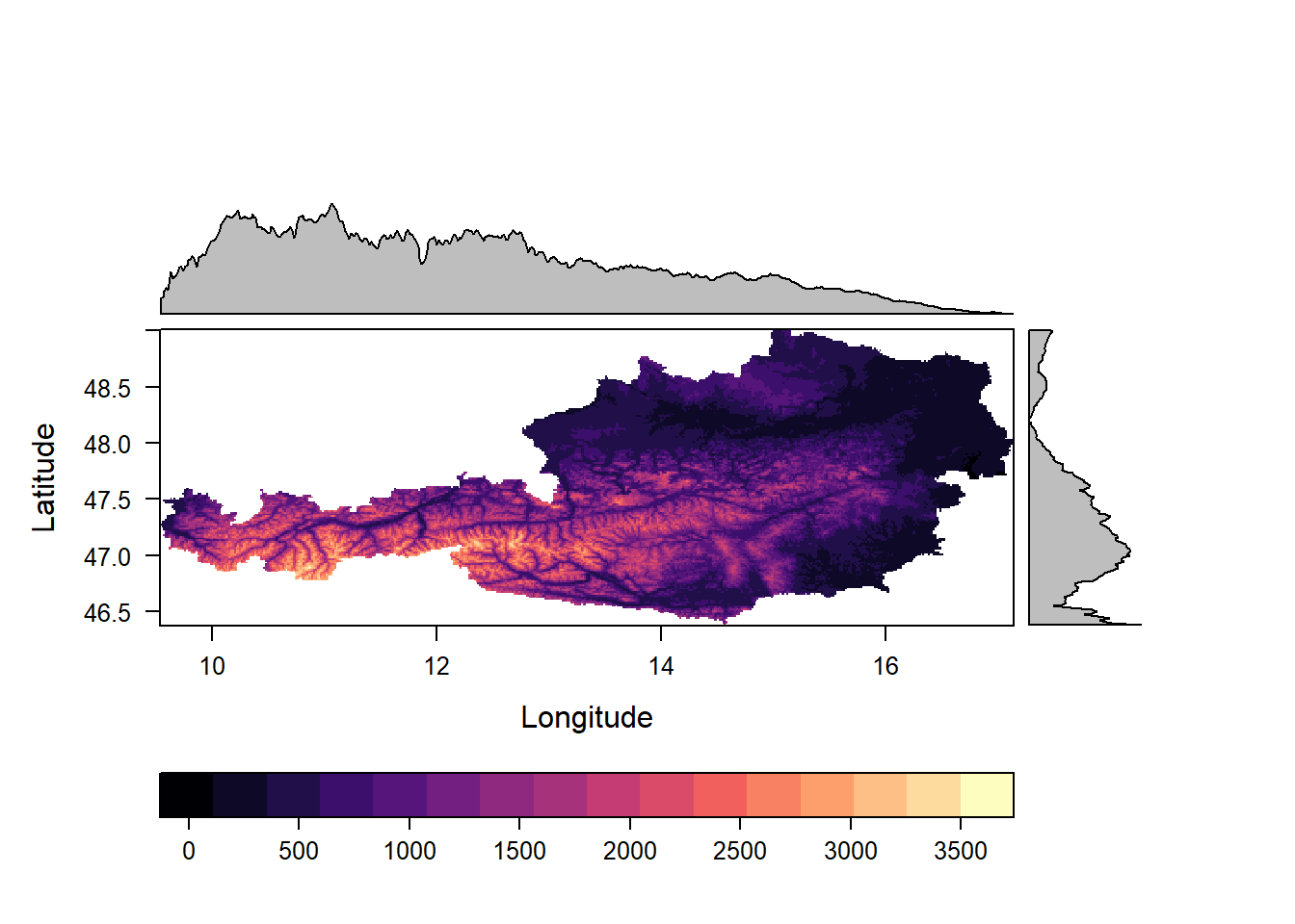
levelplot(SISmm)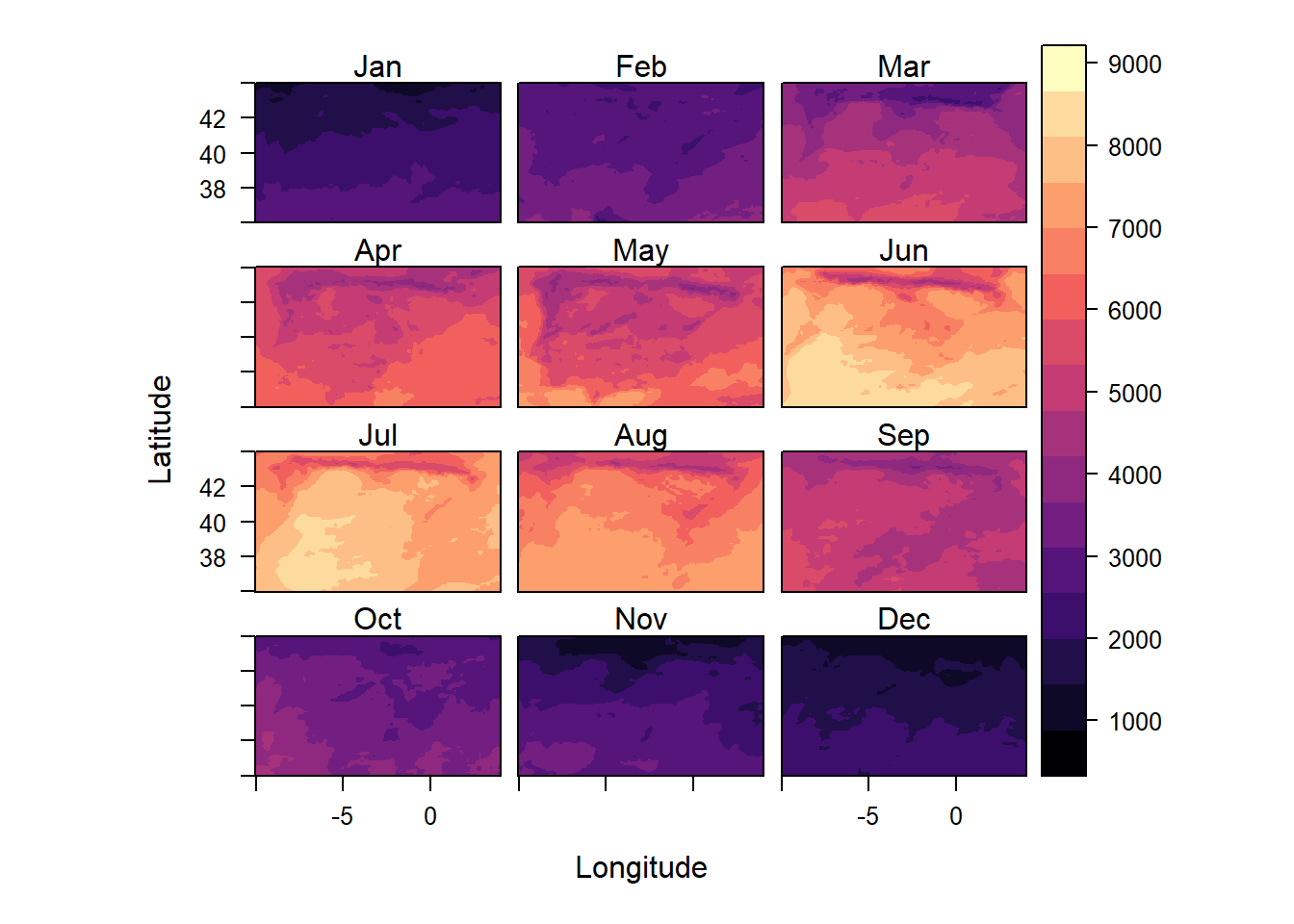
As you can see, the second plot does not have plots in the margins like the first one.
levelplot() only creates marginal plots for rasters with a single layer.
If we select one layer, the solar irradiance plots also include these marginal plots.
levelplot(SISmm, layers = 1)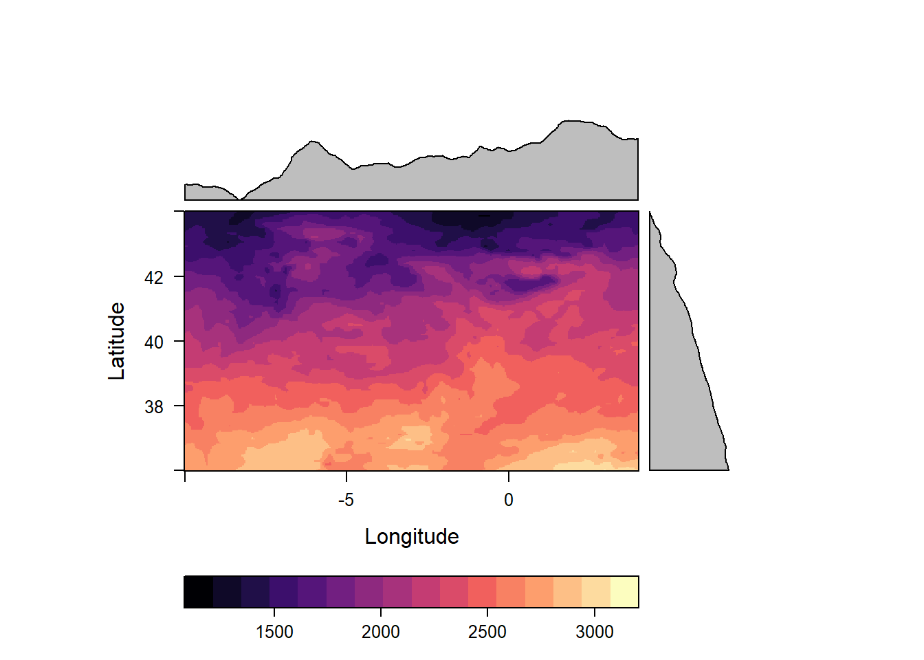
By default these plots show the means of their respective column or row but we can change this to any function we like. In the plot below, for example, we see the minimal altitude not the mean altitude in the margins.
levelplot(dem_austria,margin = list(FUN = 'min'))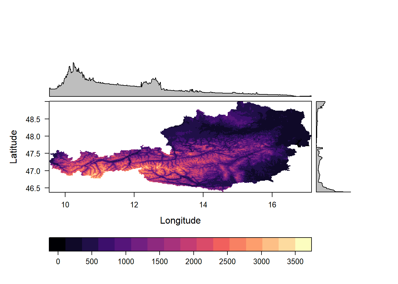
We can also alter the raster values directly in the call to levelplot().
For example, we can display the logarithm (with base e) by adding the argument: zscaleLog="e". In this plot, we also add contour lines.
levelplot(dem_austria, zscaleLog="e", contour=TRUE, margin=list(FUN = "min"))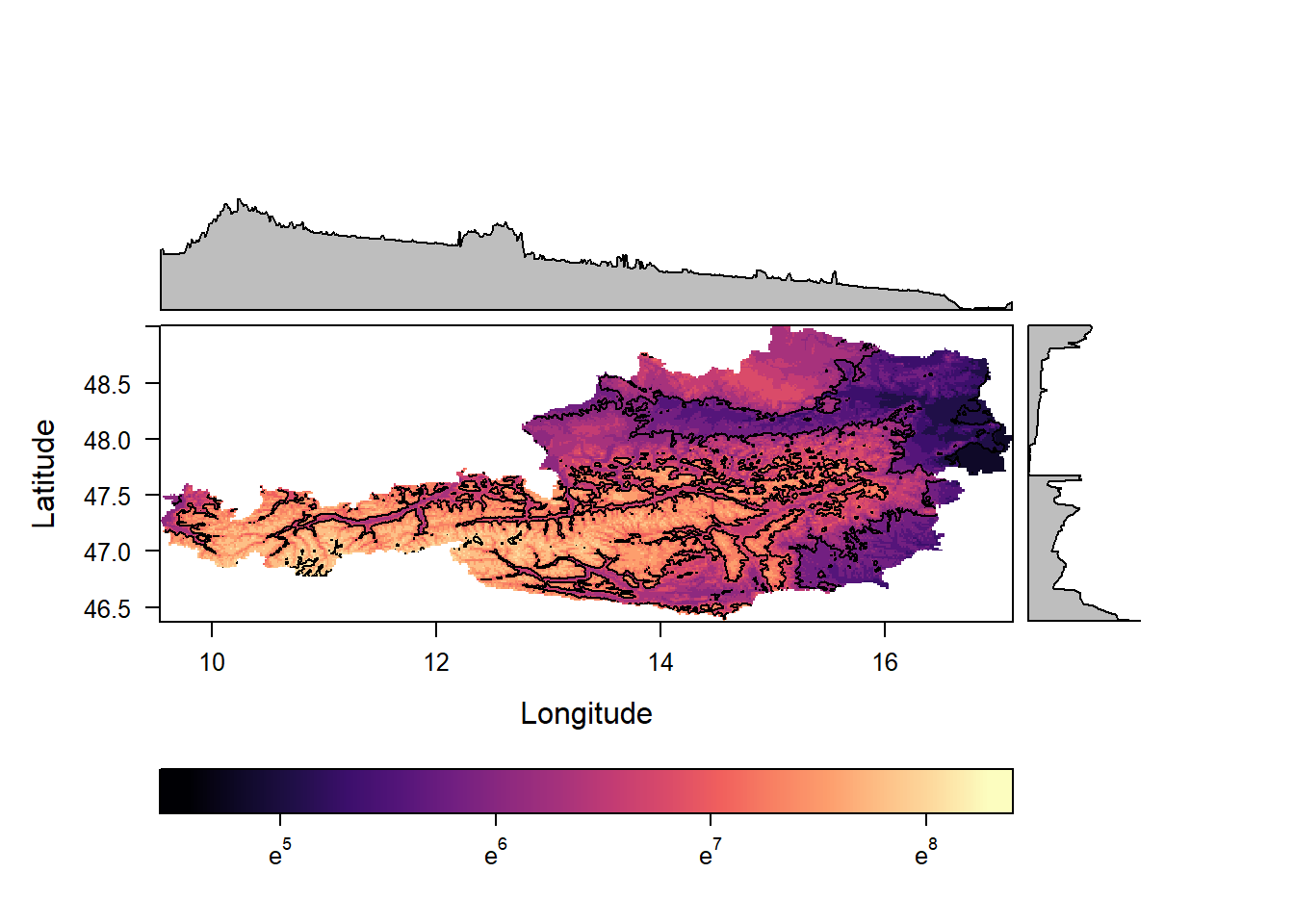
You might have noticed that sofar all plots have used the same colors (magma palette from the viridisLite package). We can easily change this to other palettes:
levelplot(dem_austria, par.settings = RdBuTheme)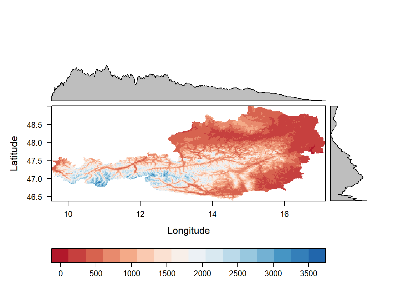
Alternative palettes are; viridisTheme, infernoTheme, plasmaTheme, YlOrRdTheme, BuRdTheme, GrTheme and BTCTheme.
Beyond the usual
All of this is very nice but merely a small extension of what raster or terra can already do.
However, rasterVis has some more tricks up its sleeve.
Like the xyplot() you can see below.
xyplot(Jan+Feb~Jul|cut(x, 2), data = SISmm, auto.key = list(space='right'))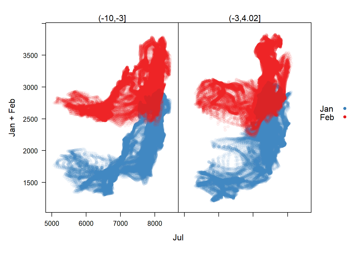 In the function call there are three building blocks: 1.
 Jan+Feb~Jul|cut(x, 2); 2. data = SISmm; 3. auto.key = list(space='right').
The latter two require less explanation so we will start with them.
The data argument receives the raster you want to plot.
The auto.key, at least here, is only there to receive the position of the legend.
The first argument is written in R’s formula notation.
You probably know it from fitting models in R, e.g. lm(x ~ y + z).
The response (Jan+Feb) is displayed on the Y-axis and the predictor (Jul) on the X-axis. Each dot in the scatter plot is one cell value of SISmm. |cut(x,2) indicates that we want to split the X-axis into two distinct plots. The values on top of the two plots indicate the X-range for each of them.
One drawback of this plot is that many points are on top of each other. A density plot would be helpful for that and indeed rasterVis provides hexbinplots just for that. Note that we have to drop the second response variable in the hexbinplot.
hexbinplot(Jan~Jul|cut(x, 2), data = SISmm)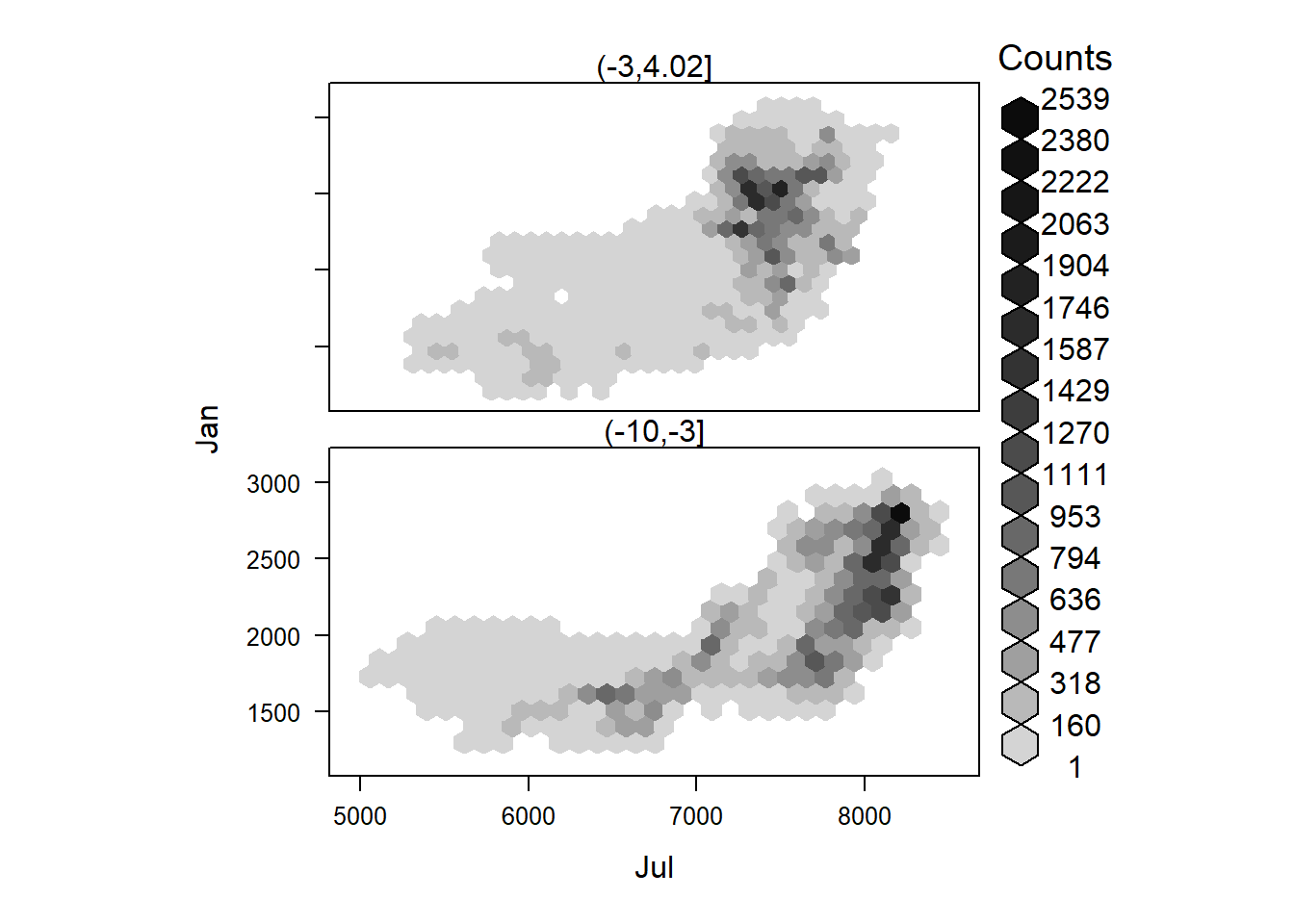
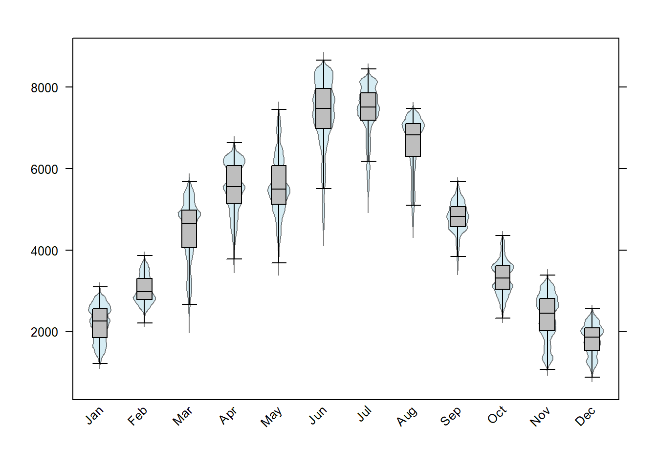
Lastly, rasterVis makes it easy to make four common exploratory plots for the raster cell values: 1. scatter plot matrices (splom), 2. histograms, 3. densityplots and box and whiskers plots.
splom(SISmm)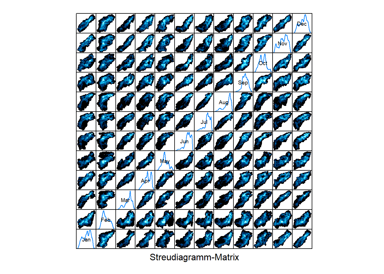
histogram(SISmm)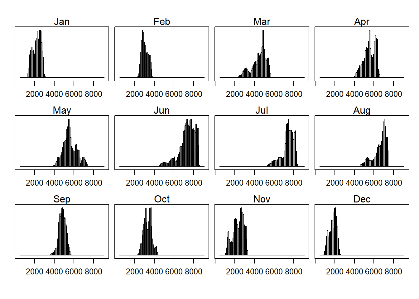
densityplot(SISmm)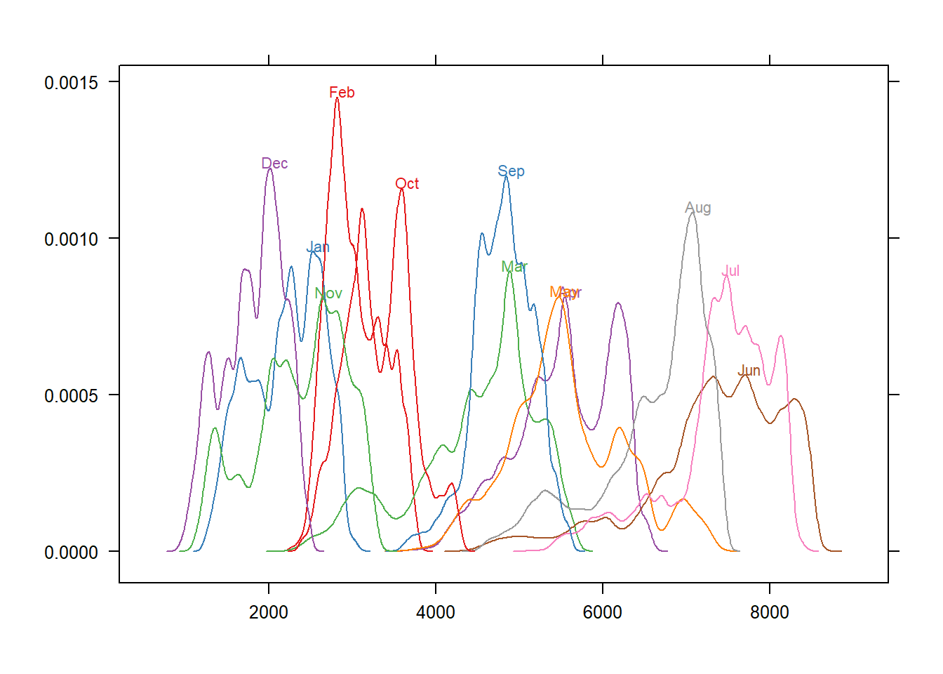
bwplot(SISmm)