R package of the week: xray
For this first post in the series, we will look at small but nice packge called x-ray. Just like a doctor can use x-rays whether something is wrong with your funky looking arm, we can use the x-ray package to see if there is anything wrong with our data set.
As an example data set we will use the antTraits data set from the mvabund package which used before in other analyses and later in the post we will also simulate some data to highlight some features of xray.
pacman::p_load(mvabund, xray, data.table)
data("antTraits")
data1 = antTraits$abund
data2 = antTraits$env
The first function,anomalies(), is great to get an initial impression of your data.
You only have to provide one argument (a data set) and it returns two objects:
1. variables
2. problem_variables
The function evaluates the following properties: number of NAs, number of zeros, number of blank or empty cells, number of infinite entries, the number of distinct values, the variable class and finally the number of cells that are considered anomalous.
The variables to two prefixes: q (quantity) and p (percent).
We can supply the function with two additional arguments;
anomaly_threshold and distinct_threshold which determine the maximum number of anomalous observations a variables can have and the minimum number of distinct values it needs to have, before it is considered problematic.
data1_anom = anomalies(data1)
data1_anom$variables[1:3,]| Variable | q | qNA | pNA | qZero | pZero | qBlank | pBlank | qInf | pInf | qDistinct | type | anomalous_percent |
|---|---|---|---|---|---|---|---|---|---|---|---|---|
| Solenopsis.sp..A | 30 | 0 |
|
26 | 86.67% | 0 |
|
0 |
|
2 | Integer | 86.67% |
| Camponotus.cinereus.amperei | 30 | 0 |
|
26 | 86.67% | 0 |
|
0 |
|
3 | Integer | 86.67% |
| Pheidole.sp..J | 30 | 0 |
|
26 | 86.67% | 0 |
|
0 |
|
3 | Integer | 86.67% |
In our case, we don’t have any blanks or NAs but lots of zeros which is common for abundance data.
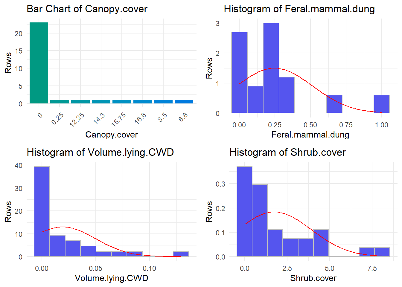
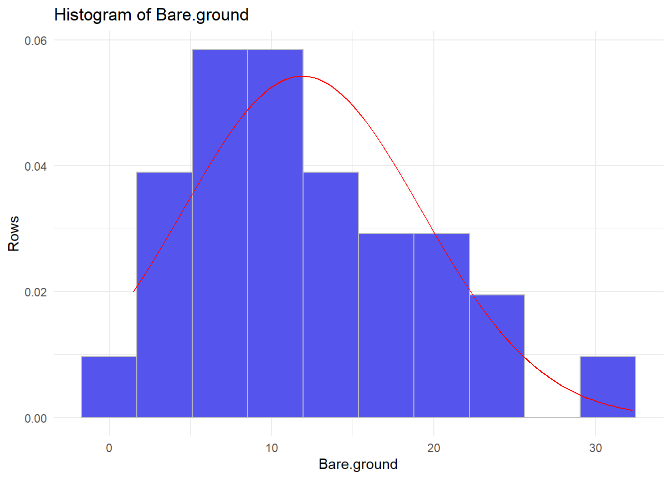
The next function,distributions(), comes in handy to determine the distributions you variables follow.
distributions(data1[,1:3])
distributions(data2)
## ================================================================================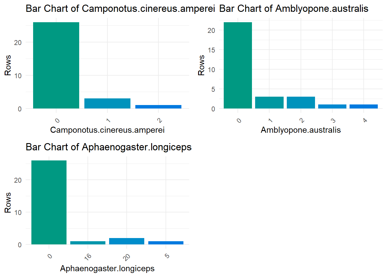
## ================================================================================
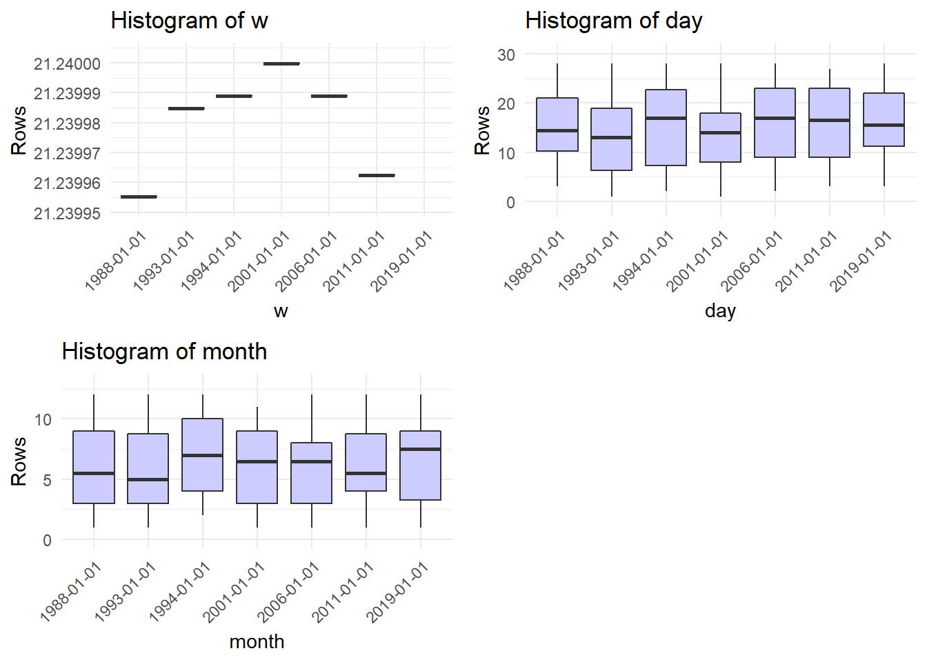
The last function,timebased(), can be used to evaluate changes in time series.
Since the antTrait data are no time series, we will have to use another data set for this.
Instead of looking for another one I will simulate some data.
In this simulated data set we sampled three variables of a population at seven different dates.
Each sample consists of 30 observations
The variables are simulated to increase (x), decrease(z), change non-linearly(w) or fluctuate randomly (y).
The first plot “Evolution of variable y” makes no sense in this context.
All other plots show boxplots of x, the year, z, w, the day and the month of sampling relative to the year of sampling.
For some reason the titles read histogram, but that is definitly no what we are seeing here.
n_dates = 7

simdat = data.table(
        day = round(runif(
                n = n_dates*30, min = 1, max = 28
        ), 0),
        month = round(runif(
                n = n_dates*30, min = 1, max = 12
        ), 0),
        year = rep(round(runif(
                n = n_dates, min = 1980, max = 2020
        ), 0),30)
)

simdat[,date := paste(day, month,year)]
simdat[,date := lubridate::dmy(date)]
setorderv(simdat, "date")
simdat[, x := 2 + year/100 * 3 + rnorm(1,0, sd = 1.6)]
simdat[, y := rnorm(1, mean = 0, sd = 20)]
simdat[, z := 300 + year/100 * -3 + rnorm(1,mean =0, sd = 1.6)]
simdat[, w := 20 + 1.24*year/1000 + -.31*(year/1000)^2]
timebased(simdat, date_variable = "date")## ================================================================================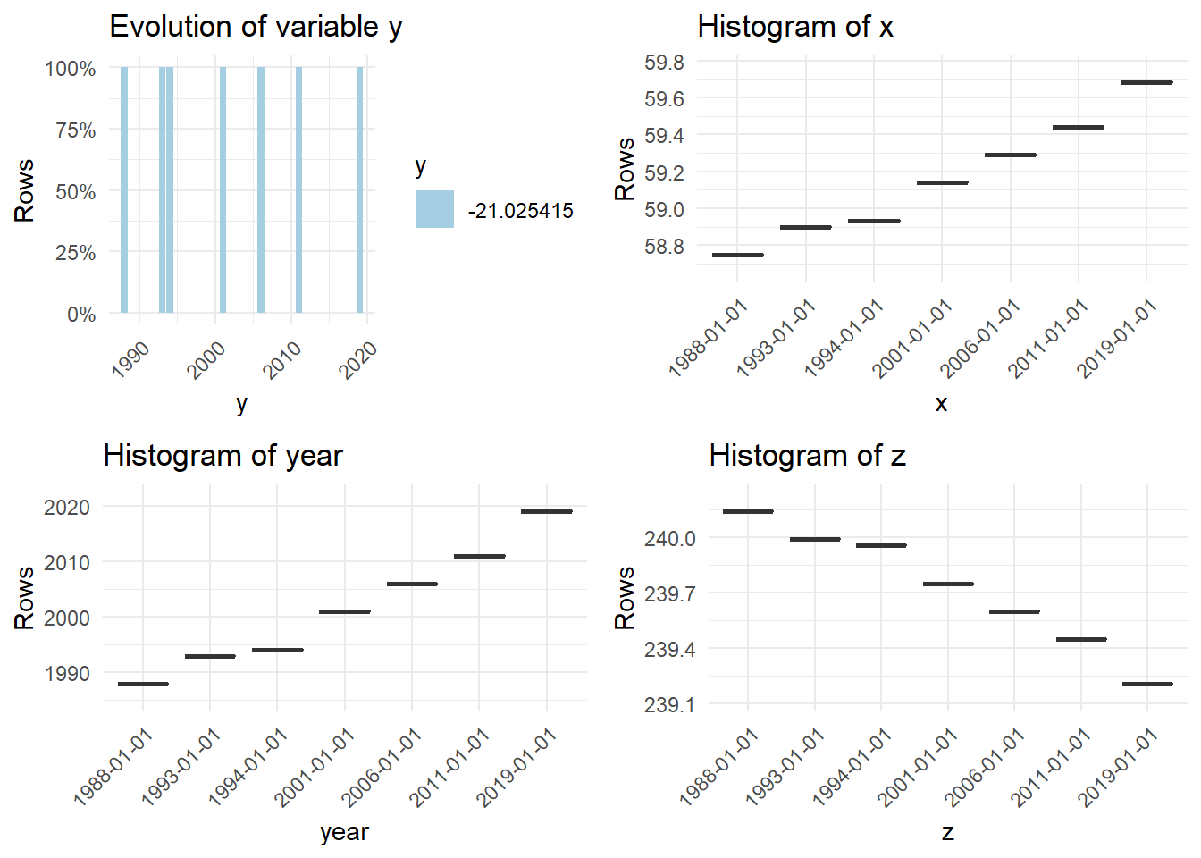
## 7 charts have been generated.