R package of the week: corrr
This week we will have a look at the corrr package.
It includes some nice possibilities to visualize correlations between mutliple variables.
I will provide some examples using the varechem data set from the vegan package.
First, load the data and have a look at them.
data(varechem)
head(varechem)
## N P K Ca Mg S Al Fe Mn Zn Mo Baresoil Humdepth
## 18 19.8 42.1 139.9 519.4 90.0 32.3 39.0 40.9 58.1 4.5 0.3 43.9 2.2
## 15 13.4 39.1 167.3 356.7 70.7 35.2 88.1 39.0 52.4 5.4 0.3 23.6 2.2
## 24 20.2 67.7 207.1 973.3 209.1 58.1 138.0 35.4 32.1 16.8 0.8 21.2 2.0
## 27 20.6 60.8 233.7 834.0 127.2 40.7 15.4 4.4 132.0 10.7 0.2 18.7 2.9
## 23 23.8 54.5 180.6 777.0 125.8 39.5 24.2 3.0 50.1 6.6 0.3 46.0 3.0
## 19 22.8 40.9 171.4 691.8 151.4 40.8 104.8 17.6 43.6 9.1 0.4 40.5 3.8
## pH
## 18 2.7
## 15 2.8
## 24 3.0
## 27 2.8
## 23 2.7
## 19 2.7As you can see, the data set contains different soil parameters like Nitrogen, Phosphorus or depth of the humus layer.
The basic function of the corrr package is correlate(), which works similar to base R’s cor().
corrr_table <- correlate(varechem, quiet = TRUE)The main difference between cor() and correlate() is that the latter returns a tibble while the former returns a matrix.
In the call above, I set the quiet argument to TRUE.
This prevents the function from returning information on the correlation metric and the method of dealing with missing values.
Both options can be set explicitly with the method and use arguments.
Here, I used their default values (pearson correlation and only using pairwise complete observations).
The package uses a tibble instead of a matrix so the we can make use of all the tidyverse functions, like only showing terms with a correlation above 0.7 with zinc …
corrr_table |> filter(Zn > 0.7) |> pull(term)## [1] "P" "Mg" "S"… or only showing correlations of nirogen and sulphur …
corrr_table |> select(N, S)## # A tibble: 14 x 2
## N S
## <dbl> <dbl>
## 1 NA -0.262
## 2 -0.251 0.753
## 3 -0.147 0.844
## 4 -0.271 0.540
## 5 -0.164 0.650
## 6 -0.262 NA
## 7 -0.0434 0.360
## 8 0.165 0.0565
## 9 0.0792 0.275
## 10 -0.132 0.710
## 11 -0.0577 0.432
## 12 0.106 0.0808
## 13 0.0760 0.158
## 14 -0.0421 -0.187… or asking what the mean correlation of nitrogen and sulfur to all other variables is.
corrr_table |>
  select(N,S) |>
  map_dbl(~mean(., na.rm = T))
## N S
## -0.07261118 0.33921879There are also some new data wrangling functions that corrr introduces.
shave() sets the lower or upper triangle to NA.
shave(corrr_table, upper = TRUE)## # A tibble: 14 x 15
## term N P K Ca Mg S Al Fe Mn
## <chr> <dbl> <dbl> <dbl> <dbl> <dbl> <dbl> <dbl> <dbl> <dbl>
## 1 N NA NA NA NA NA NA NA NA NA
## 2 P -0.251 NA NA NA NA NA NA NA NA
## 3 K -0.147 0.754 NA NA NA NA NA NA NA
## 4 Ca -0.271 0.737 0.665 NA NA NA NA NA NA
## 5 Mg -0.164 0.598 0.628 0.798 NA NA NA NA NA
## 6 S -0.262 0.753 0.844 0.540 0.650 NA NA NA NA
## 7 Al -0.0434 0.0453 0.119 -0.206 -0.118 0.360 NA NA NA
## 8 Fe 0.165 -0.128 -0.0941 -0.332 -0.202 0.0565 0.824 NA NA
## 9 Mn 0.0792 0.536 0.537 0.443 0.258 0.275 -0.470 -0.436 NA
## 10 Zn -0.132 0.702 0.600 0.678 0.708 0.710 -0.0551 -0.312 0.364
## 11 Mo -0.0577 0.172 0.0682 -0.157 0.0348 0.432 0.510 0.221 -0.205
## 12 Baresoil 0.106 0.0139 0.169 0.178 0.239 0.0808 -0.400 -0.457 0.246
## 13 Humdepth 0.0760 0.152 0.266 0.244 0.371 0.158 -0.494 -0.494 0.510
## 14 pH -0.0421 -0.0294 -0.233 0.0914 -0.0925 -0.187 0.418 0.440 -0.389
## # ... with 5 more variables: Zn <dbl>, Mo <dbl>, Baresoil <dbl>,
## # Humdepth <dbl>, pH <dbl>We can rearrange the columns so that highly correlated columns are next to one another with rearrange(), which I will show below when we come to plots, because this is only relevant for plotting.
The focus() function is very similar to select(). The only difference is that the the term column is automatically selected in the focus() functions.
focus(corrr_table, N) |>
  head()
## # A tibble: 6 x 2
## term N
## <chr> <dbl>
## 1 P -0.251
## 2 K -0.147
## 3 Ca -0.271
## 4 Mg -0.164
## 5 S -0.262
## 6 Al -0.0434The last in the bunch is fashion() which can be used to create a nice looking version of the table: no leading zeros, NAs are replace by empty cells
fashion(corrr_table) ## term N P K Ca Mg S Al Fe Mn Zn Mo Baresoil
## 1 N -.25 -.15 -.27 -.16 -.26 -.04 .17 .08 -.13 -.06 .11
## 2 P -.25 .75 .74 .60 .75 .05 -.13 .54 .70 .17 .01
## 3 K -.15 .75 .66 .63 .84 .12 -.09 .54 .60 .07 .17
## 4 Ca -.27 .74 .66 .80 .54 -.21 -.33 .44 .68 -.16 .18
## 5 Mg -.16 .60 .63 .80 .65 -.12 -.20 .26 .71 .03 .24
## 6 S -.26 .75 .84 .54 .65 .36 .06 .27 .71 .43 .08
## 7 Al -.04 .05 .12 -.21 -.12 .36 .82 -.47 -.06 .51 -.40
## 8 Fe .17 -.13 -.09 -.33 -.20 .06 .82 -.44 -.31 .22 -.46
## 9 Mn .08 .54 .54 .44 .26 .27 -.47 -.44 .36 -.20 .25
## 10 Zn -.13 .70 .60 .68 .71 .71 -.06 -.31 .36 .28 .04
## 11 Mo -.06 .17 .07 -.16 .03 .43 .51 .22 -.20 .28 .03
## 12 Baresoil .11 .01 .17 .18 .24 .08 -.40 -.46 .25 .04 .03
## 13 Humdepth .08 .15 .27 .24 .37 .16 -.49 -.49 .51 .14 .06 .59
## 14 pH -.04 -.03 -.23 .09 -.09 -.19 .42 .44 -.39 -.09 -.17 -.53
## Humdepth pH
## 1 .08 -.04
## 2 .15 -.03
## 3 .27 -.23
## 4 .24 .09
## 5 .37 -.09
## 6 .16 -.19
## 7 -.49 .42
## 8 -.49 .44
## 9 .51 -.39
## 10 .14 -.09
## 11 .06 -.17
## 12 .59 -.53
## 13 -.72
## 14 -.72While all these things are nice the really cool thing about corrr is the plots:
corrr_table |>
  rearrange() |>
  rplot()
## Registered S3 method overwritten by 'seriation':
## method from
## reorder.hclust vegan## Don't know how to automatically pick scale for object of type noquote. Defaulting to continuous.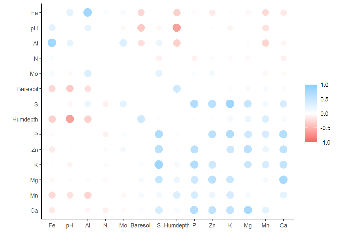
and
corrr_table |>
  network_plot()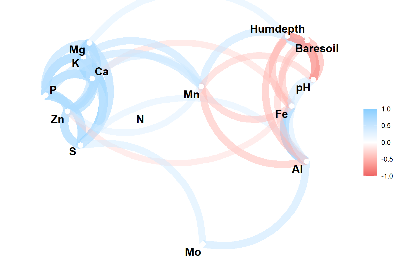
In the network plot highly correlated variables appear closer together and are joined by stronger (darker) paths.
The function includes an argument to exclude correlations below some threshold (min_cor), to change the color scale (colours), and lastly and a argument for whether arrows should be straight or curved (curved).
So we could modify the above plot to this:
corrr_table |>
  network_plot(
          min_cor = 0.5,
          colours = c("green", "black", "blue"),
          curved = FALSE
  )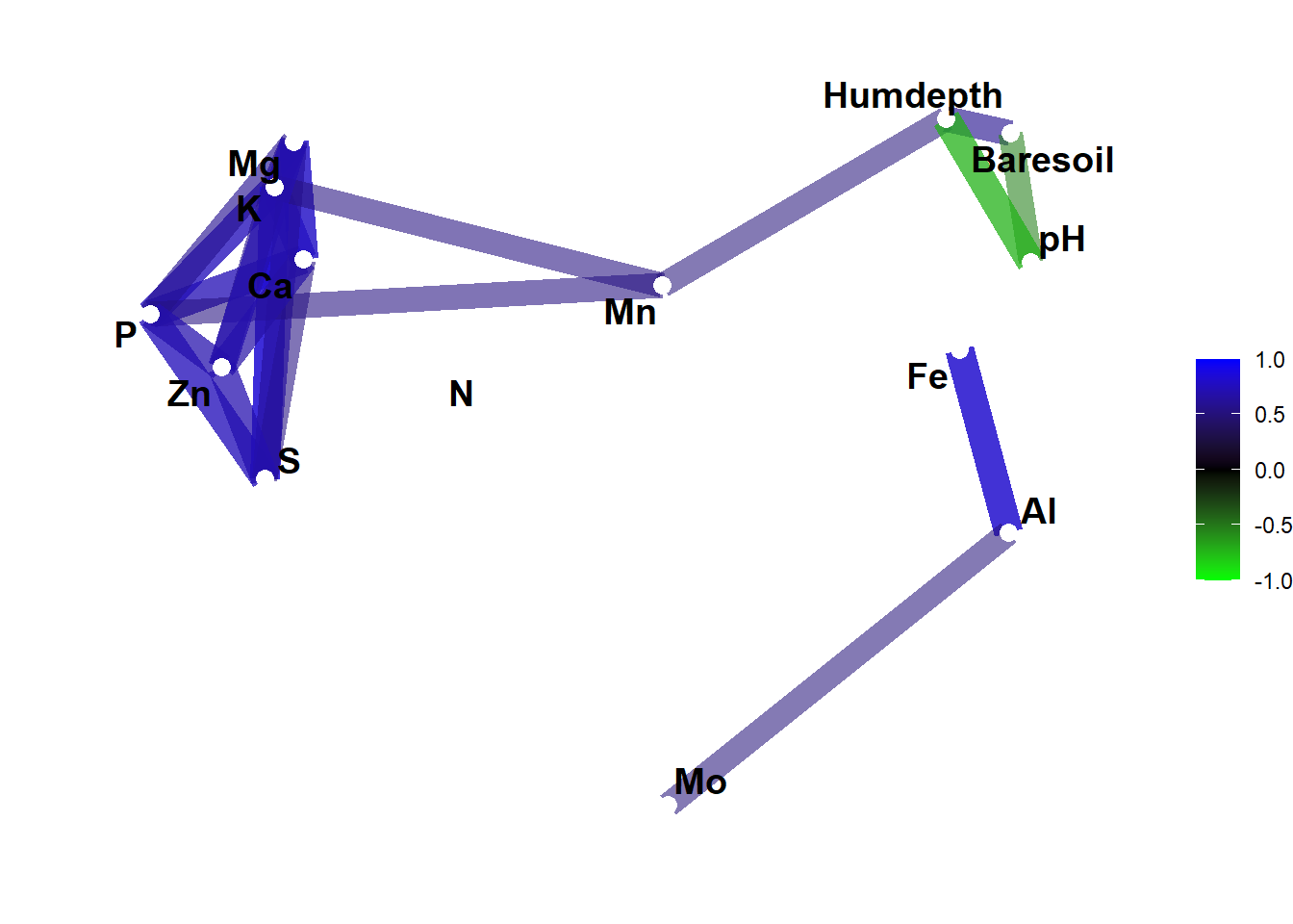
Yes, the first one was prettier but now you know what you can do with this.